April Mae
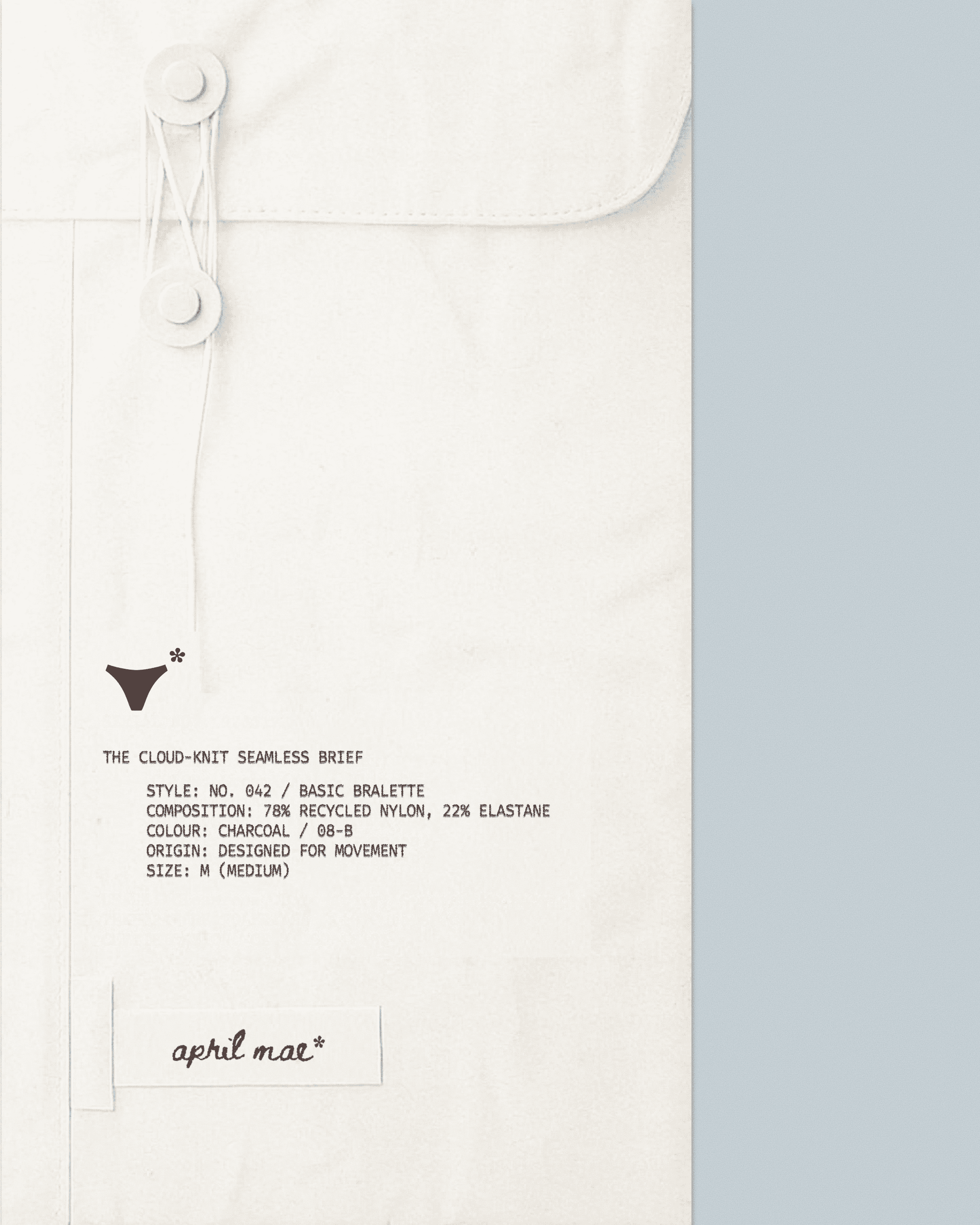
April Mae is a conceptual brand identity, packaging system, and digital layout for an elevated seamless underwear brand. Designed around skin-like comfort, soft structure, and everyday ease, the project balances minimal packaging design with tactile editorial storytelling.
Year
2025
Project Type
Brand Identity
Package Design

CONCEPT
Built around the belief that intimate wear should feel weightless and second-skin, April Mae replaces rigid structuring with soft, adaptive forms. The identity communicates through gentle warmth and quiet ease, shifting focus away from traditional lingerie tropes and toward effortless daily comfort.
VISUAL DIRECTION
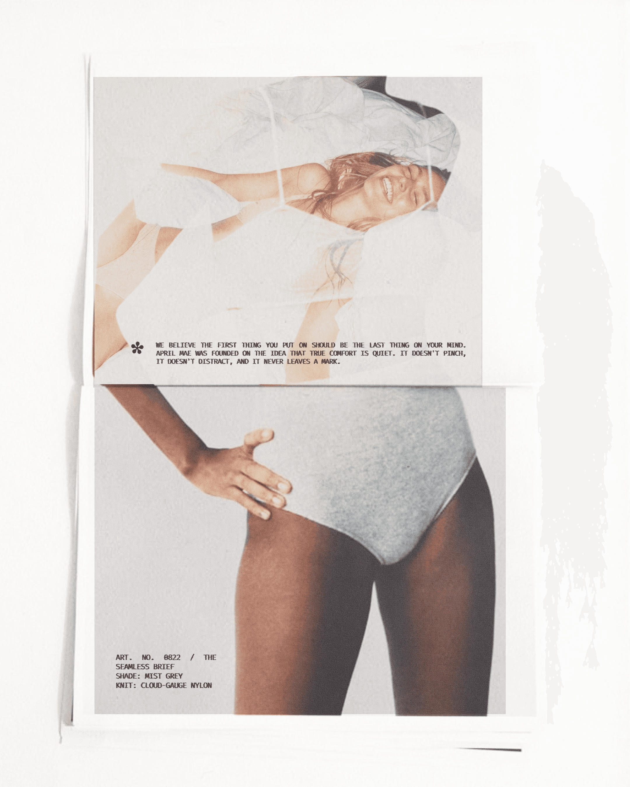
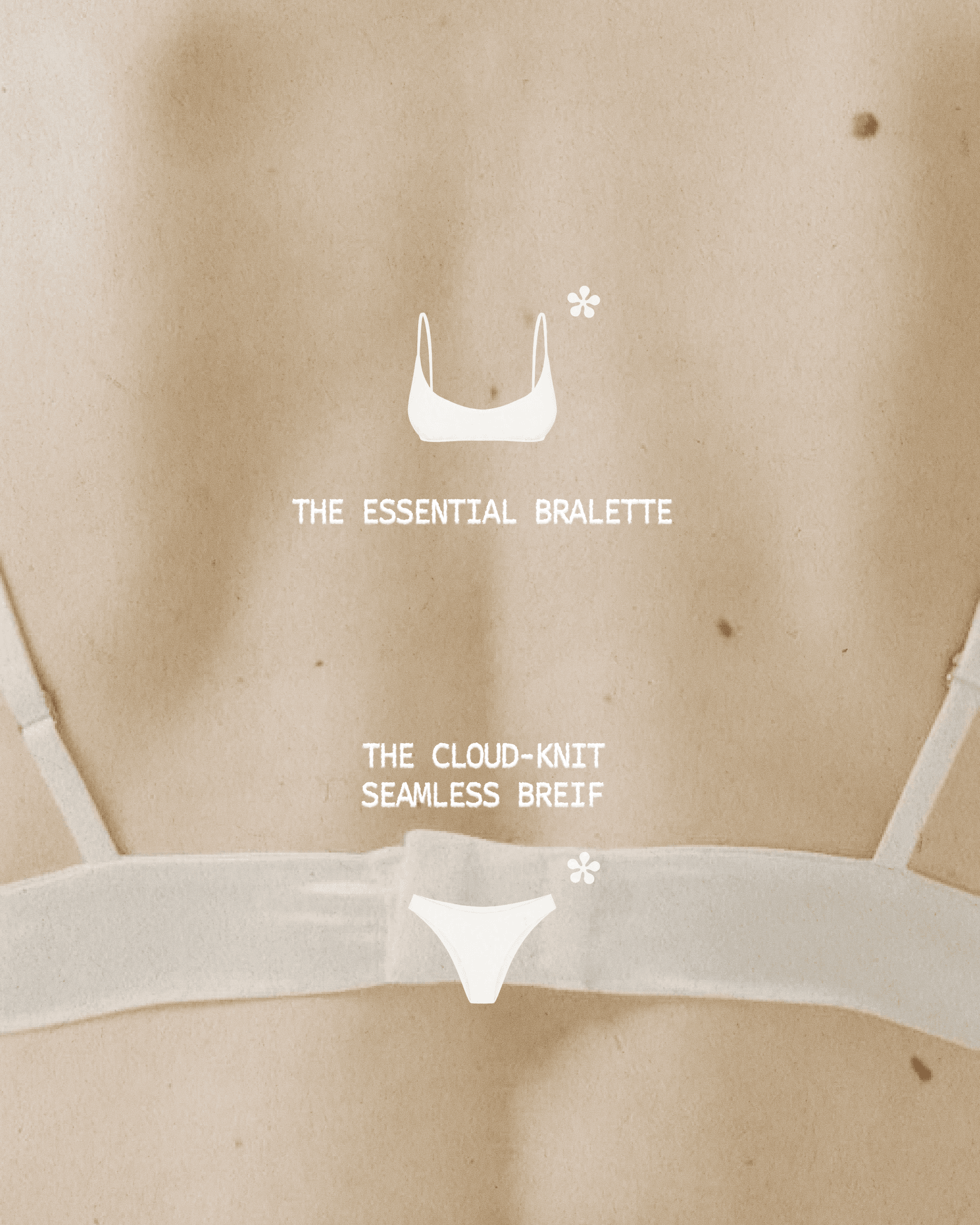
The visual system reflects softness, utility, and understated luxury. Technical product callouts pair with airy photography to highlight fabric performance and seamless construction.
COLOR & MATERIAL
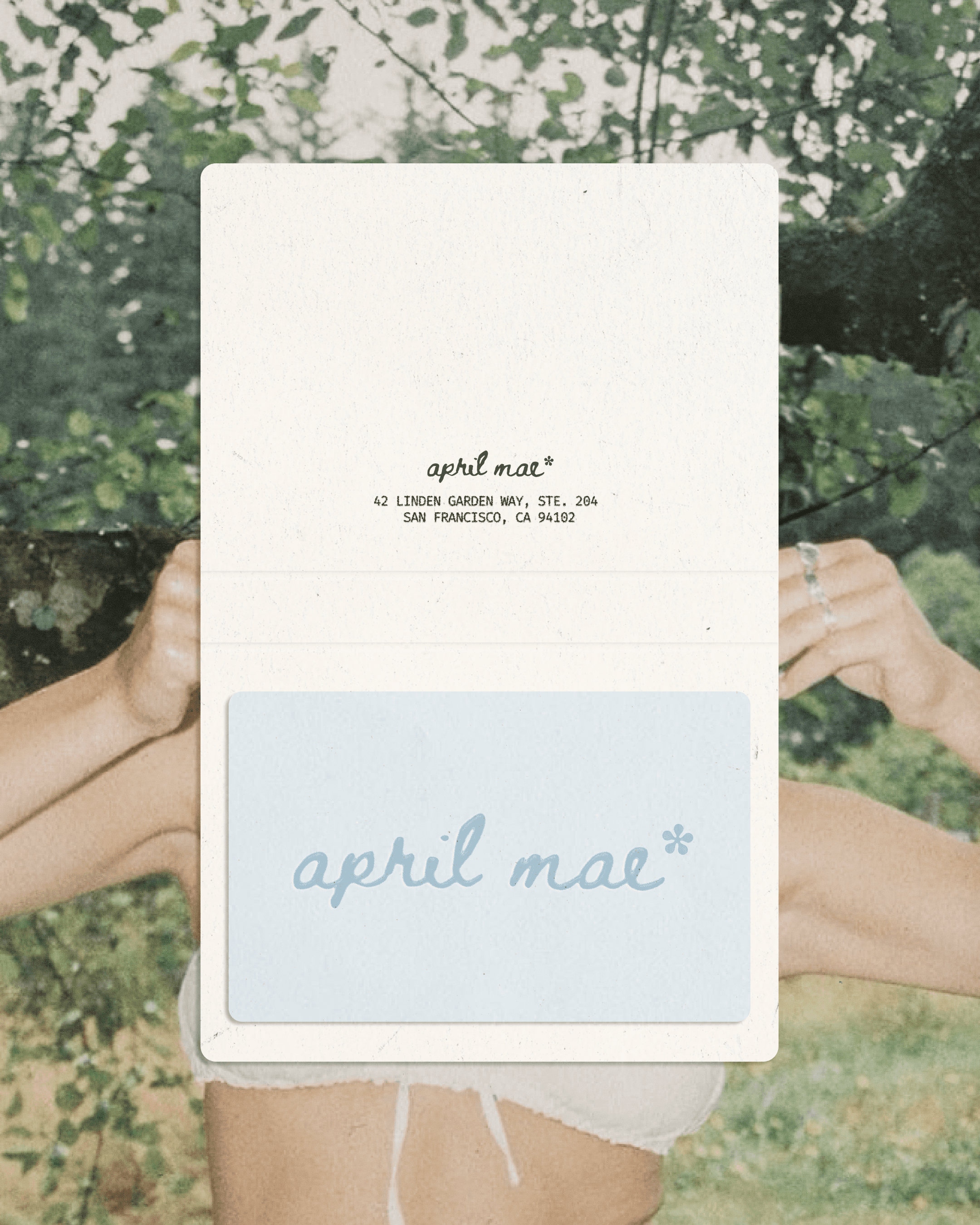
Soft linen, charcoal gray, muted cloud blue, and skin-toned neutrals create a calming, organic palette.
TYPOGRAPHY
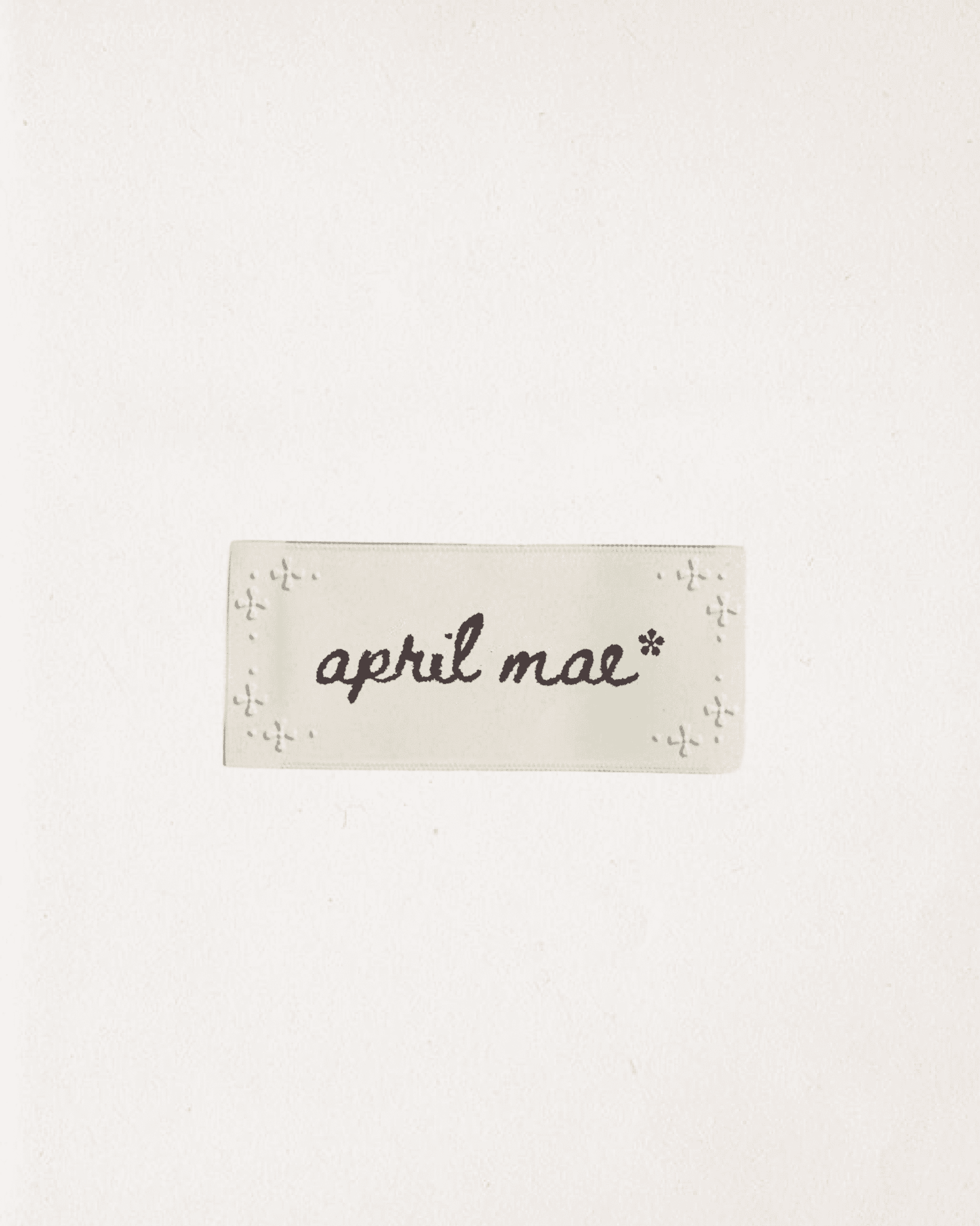
A delicate script logotype paired with clean, technical typewriter serif details gives the brand an artisanal yet structured feel.
PACKAGING
Minimal paper tags, spec-sheet labeling, and lightweight recyclable packaging emphasize honest materials and transparency.
EXPRESSION & APPLICATION
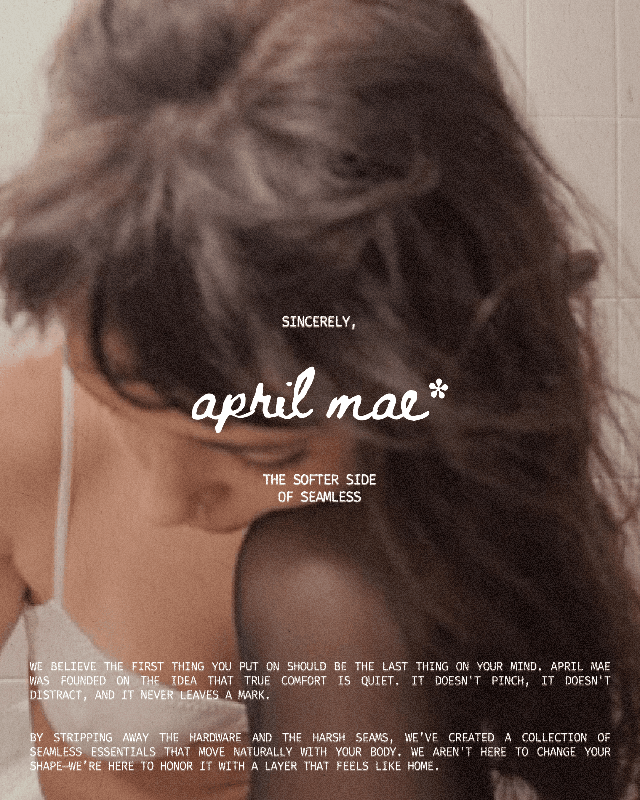
Applied across product packaging, garment labeling, and digital lookbooks, the system maintains a consistent focus on texture and movement. Editorial imagery paired with candid sunlit art direction presents each piece as an essential, unpretentious everyday staple.
like what you see?
Feel free to check out my next case study, or send me a message on Linkedin!
2026 portfolio by anna knick
aknick90@gmail.com